BVNA Search
Brand refresh, website, brochures, social media content

My Role
Art Director, Graphic & UX/UI Web Designer
Tools
Figma, Framer, Adobe Creative Cloud (Illustrator, Photoshop, InDesign)
Year
2024
A bold, colourful rebrand that stays senior.
BVNA Search wanted a rebrand with colour, a full refresh that felt novel without losing the professional tone. They recruit for senior roles in renewable energy and work with businesses, so the new look had to stay credible while embracing a bolder, more dynamic visual language, and stay consistent everywhere.
The approach
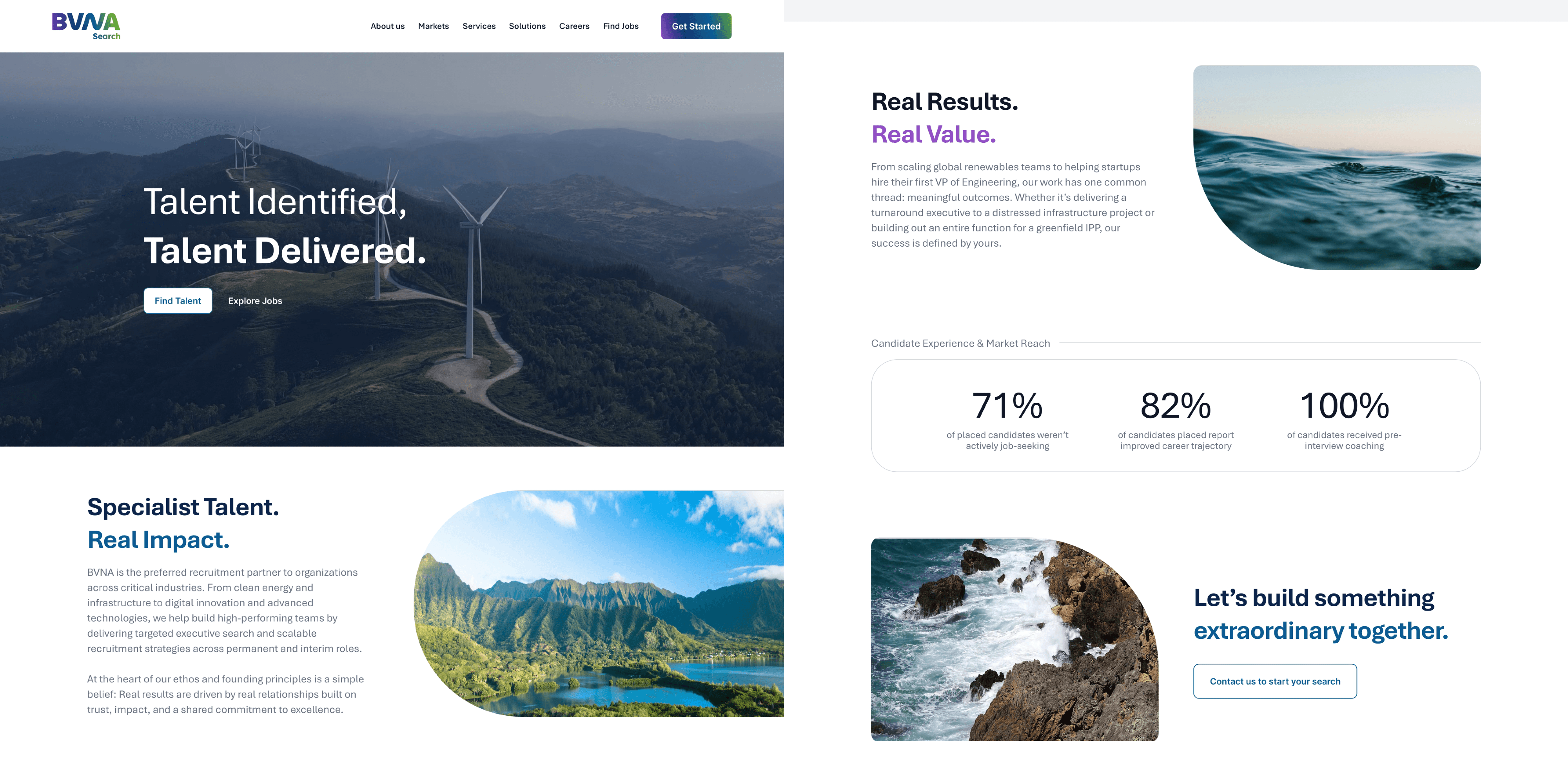
I proposed a fun but corporate identity and applied it across every channel. The wider palette and dynamic shapes finally gave us room to play. Socials went bolder, website is clean and straightforward and brochures now use colour and shape to build more interesting editorial layouts.
Rebranding procress
I've been working with Bavana Partners for a while before they decided to go for this change, as I was familiar with their previous image and their stakeholders, I was confident to propose ideas that took the brand out of their comfort zone, going for a wider vibrant color scheme and rounder, more dynamic shapes.
Old version

(No icon)
New version



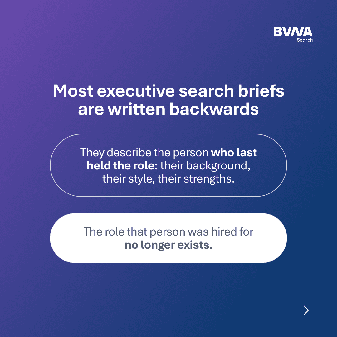
Social media content
Fully utilizing their full color palette to make the best of the vibrant colors and rounded shapes.


Brochure design
Helping them manage all their information in an easy to read format, using the new colors and shapes for an interesting composition.
The impact
BVNA got a look that feels modern and energetic but still reads as senior and trustworthy. Because I'd already been working with this brand for a while, the real lesson was in how you introduce a bold new visual system to a brand with history that should evolve with their team and vision.
