Select TMS
Brand identity, website, brochures, social media content
My Role
Art Director, Graphic & UX/UI Web Designer
Tools
Figma, Framer, Adobe Creative Cloud (Illustrator, Photoshop, InDesign)
Year
2024 -
A fresh identity that speaks to the next generation of renewable energy.
Select TMS is a recruitment company in the renewable energy field, their target audience is professionals who are starting their career in this industry. They needed a consistent, fresh look that speaks to candidates (B2C) and companies (B2B) alike.
The approach
I proposed a fresh identity and created the full ecosystem: website, brochures, and social. Building a modular system: repeatable components and motifs drawn from the brand's core elements, like the leaf shape and colour palette to ensure a shared visual language.
My workflow
For initial brand study, research, design, iteration and application.

Research and Early Exploration
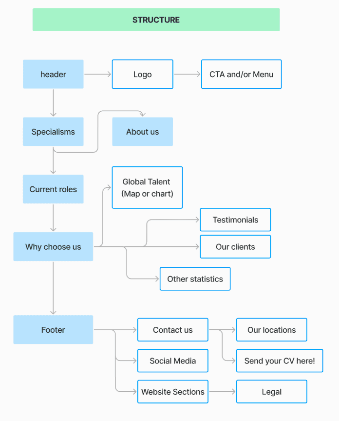
For this project I was tasked the branding and website design at the same time. I started by doing market research, analyzing our competitors look, tone of voice and channels. With this references I made the user flow for the website and initial sketches for the logo.
Here's some of my thought process:


Branding design
Inspired by windmills and leaves, I sketched some concepts for the Select icon. The colors follow autumn leaf tones, the wordmark is italic to show movement, and the "tms" sits inside a leaf to reflect a fresher take on our Talent Management Solutions.


Social media content
This is the most playful and dynamic application of the brand, here we can see a full application of the color scheme, at times it goes for a more sleek look, with the use of the leaf and other geometrical shapes and other times it uses paper, cardboard and "organic" textures to give the socials a handmade look. Here's also some of my thought process behing content planning:


Brochure design
This is the most "serious" application of the brand, using the leaf pattern as the main background and divider for a dynamic yet easy to read composition, giving the brochure a bit of movement while still being a corporative document ready for B2B negotiations and proposals.
The impact
The result is one integral identity and functional ecosystem: playful and fresh on social, clear and informative on the website, and professional corporative and compliant in the brochures, all unmistakably Select TMS.
